![]()
Greetings, I have shortlisted a distinctive collection of designs to enhance your UI/UX game.
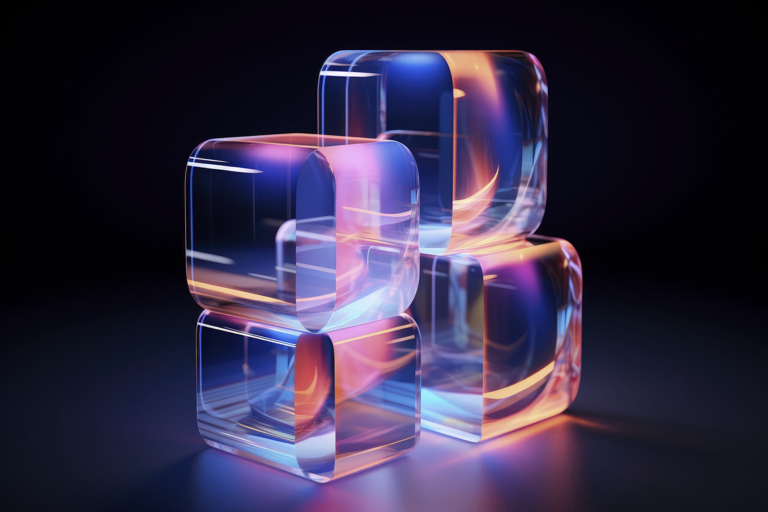
1. Glassmorphism
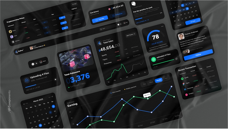
What is Glassmorphism? Glassmorphism refers to a visual design that utilizes translucent elements with a frosted-glass pattern, ensuring layering and interface depth. Frosted glass effects were initially used in 2013–2017 in iOS and Windows Vista/7 Aero Glass. While in 2017, Microsoft Fluent Design System enabled the blur effect. Gaining popularity in 2020, glassmorphism ensured a frosted glass effects in design communities such as Behance and Dribble. Why it matters: It adds a modern, sleek aesthetic, enhancing visual hierarchy without overwhelming the user. While incorporating glassmorphism in your user interface, it is necessary to understand the accessibility restrictions of translucent elements.
Why it matters:
It introduces a sense of depth and modernity while maintaining readability. Designers must, however, be cautious about accessibility, particularly contrast levels and readability for visually impaired users.
This trend is especially useful in digital services like banking apps, cybersecurity dashboards, and fintech platforms, where designers need to convey a sense of trust, and innovation. It subtly separates data cards or menus without overwhelming the user, making it easier to focus on tasks while reinforcing a premium feel.
Example:
. Banking UI: Displays account summaries on glass panels with background blur, giving a futuristic feel while keeping data readable.
. Security Platforms: Uses translucent overlays for threat alerts or identity verifications, keeping the interface sleek yet professional.
Examples : https://dribbble.com/search/glassmorphism
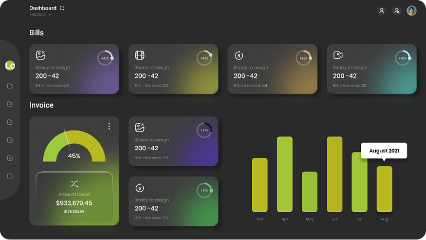
2. Dark Mode by Default
What is Dark Mode? Dark mode utilizes a light text on a dark background, minimizing the pressure on eyes, resulting in improved battery health of screens. This helps in enhancing screen time. Such a feature provides a great experience in low light or dull environments.
Why it matters (Expanded):
Dark Mode has evolved beyond a visual preference it’s now a default feature in modern interfaces because of its practical and psychological benefits. It reduces eye strain during extended usage, enhances focus, and even improves battery life on OLED and AMOLED screens by using less power for dark pixels.
It’s widely used in platforms that require prolonged interaction, data focus, or visual contrast, such as:
- AI Tools & Developer Dashboards: IDEs like Visual Studio Code and tools like ChatGPT or Notion AI often use dark themes for coding, data handling, or text generation.
- NFT Marketplaces: Platforms like OpenSea and Foundation use dark backgrounds to enhance digital art visibility and create a premium feel.
- Crypto & Trading Apps: Dark mode supports long-term chart reading and data visualization.
- Fitness & Meditation Apps: Calm, Fitbod, and Headspace often use dark themes to create a relaxing or focused environment.
- Gaming & Entertainment: Streaming and gaming platforms (like Steam or Discord) favor dark UIs to reduce eye fatigue and highlight content.
Bonus: Dark UIs provide accessibility benefits for users with light sensitivity or visual impairments by offering higher contrast ratios when implemented correctly.
- Microsoft Office dark theme
- Slack and Twitter default dark UIs
- Visual Studio Code, Discord, Calm App
Weblink: https://www.microsoft.com/en-us/microsoft-365/microsoft-office
3. Artificial Intelligence (AI)-Driven Personalization
What is AI-Driven Personalization? With the advent of science and technology, AI algorithms help users to enjoy automation for their behavior, demographics, preferences, and real-time patterns. Why it matters: Customized interfaces improve user involvement, resulting in better satisfaction based on showcasing more appropriate content as well as features.
Why it matters:
When a website or app feels like it “knows” you, it’s easier to use and more enjoyable. AI helps apps show you the right content, save time, and avoid things you don’t care about.
It’s very useful in:
- Email apps — Like Gmail, which sorts your emails and gives smart replies.
- Shopping apps — Like Amazon, which shows products you might like.
- Music & video apps — Like Spotify or Netflix, that suggest what to listen to or watch next.
- Learning apps — Like Duolingo, which changes lessons based on your progress.
Weblink: https://mail.google.com/mail/
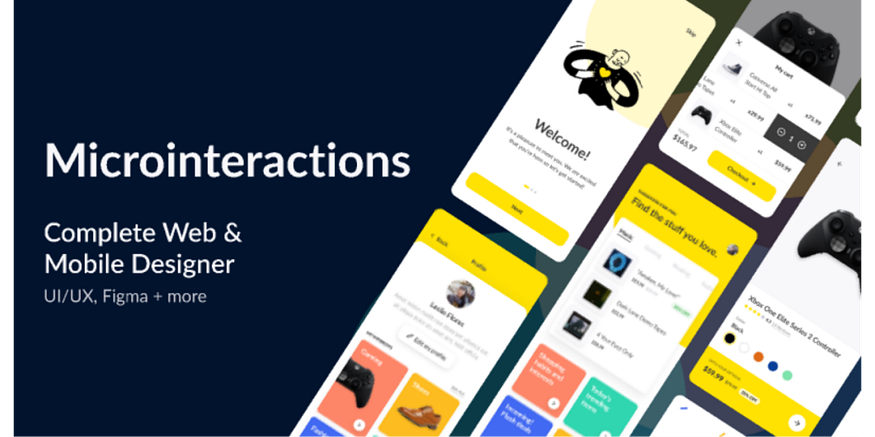
4. Microinteractions
What is microinteraction? Microinteraction offers users’ feedback, conveying status through animations or design elements to avoid errors. This has become a branding tool. When it is triggered by a GUI command, visible feedback appears in close proximity. Why it matters: They improve users’ experience by enabling interfaces intuitive yet responsive.
Why it matters:
These little details help users feel more connected and in control. They make the interface feel smooth, friendly, and easy to use. Microinteractions can also show personality and make a brand feel more alive.
You’ll often see microinteractions in:
- Like buttons (e.g. Facebook’s heart or emoji animation)
- Toggles and switches (e.g. a light turning on when you enable dark mode)
- Form fields (e.g. shaking if you enter the wrong password)
- Loading animations (e.g. dots bouncing while something loads)
Even though they’re small, these moments make a big difference in making apps feel polished and fun.
Weblink: https://www.facebook.com/
https://dribbble.com/search/microinteraction
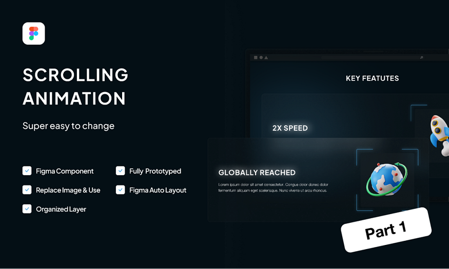
5. Scroll Animations
What is scroll animation? Scroll Animations enables animations by scrolling based on automation or a dynamic response to websites or webpages. Why it matters: Scroll animation helps users to grab attention using their content in a visually engaging pattern.
Why it matters:
Scroll animations make websites more fun and exciting to explore. Instead of showing everything at once, they reveal content step-by-step, which helps guide the viewer’s attention and keeps them interested. It’s a great way to tell a story or highlight important parts of a page.
This style is often used in:
- Portfolios
- Creative agencies
- Landing pages
- Product showcases
- Storytelling websites
Good scroll animation can improve the user experience, but too much of it can slow down the page — so it’s best used wisely.
Example: https://www.awwwards.com/websites/scrolling/
https://dribbble.com/search/microinteractionhttps://dribbble.com/search/scroll%20animation

6. Inclusive & Accessible Design
What is inclusion or accessible design? These are designing interfaces that enable users to experience a wide range of accessible designs to expand their understanding and find solutions as per their needs. Why it matters: Ensures user-friendly making of mobile apps or webpages. Example: GOV.UK website, a UK government-based digital website that is based on the bright color contrast for better readability. Its ability to navigate through the keyboard also facilitates its usage.
Weblink: https://gov.uk/
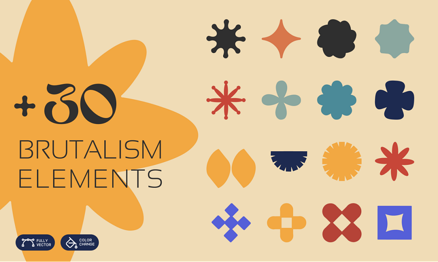
7. Brutalist Design Revival
What is Brutalist Design Revival? It is based on raw material and unpolished designs, particularly concrete. This is characterized by stark layouts, bold typography, having minimal color combinations. It is a reemergence of Brutalist design principles, which emerged in the late 50s or 60s in the field of graphic design, architecture and web design. Why it matters: Brutalism challenges traditional aesthetics and emphasizes raw functionality, authenticity and honesty. This helps in creating a bold experience for users. Example: Smashed.by is a website by Alex Smashed that uses stripped or raw aesthetic designs based on minimal colors, large, monospaced text and firm grids. The design exhibits almost zero visual polishing.
Weblink: https://smashed.by/
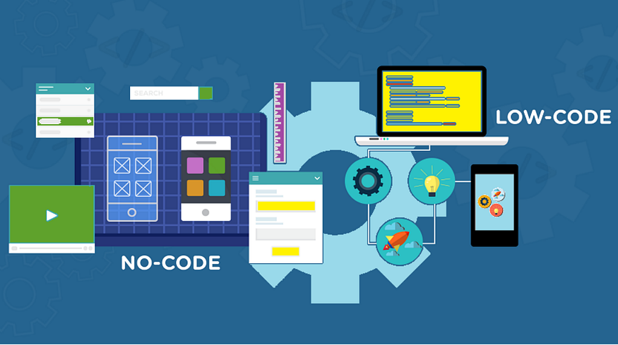
8. No-Code & Low-Code Tools
What are No-Code & Low-Code Tools? These are the platforms that enable users to create applications as well as websites with the least and almost no coding. Despite creating the program from scratch, no coding tools help you create a complex website or application without mastering the art of coding. Why it matters: They help in empowering non-developers to speed up digital innovation without depending on technical expertise. Example: Comet, a freelancing platform which is created with the help of Bubble, a no-coding tool.
Weblink: https://www.comet.co/en/
9. Bold Typography
What is Bold Typography? This utilizes the use of big, attention-seeking fonts in order to convey information and create visual hierarchy. Why it matters: maximizes users’ attention to the content, ensures better visualization. Example: The “Outline” uses oversized and striking headlines to deliver a provocative, loud and attention-seeking core message.
Weblink: https://getoutline.org/
By using the aforementioned tools in your designs, you create modern interfaces that can better resonate with the modern clients’ needs.
by Kashaf Maryam khan in Medium