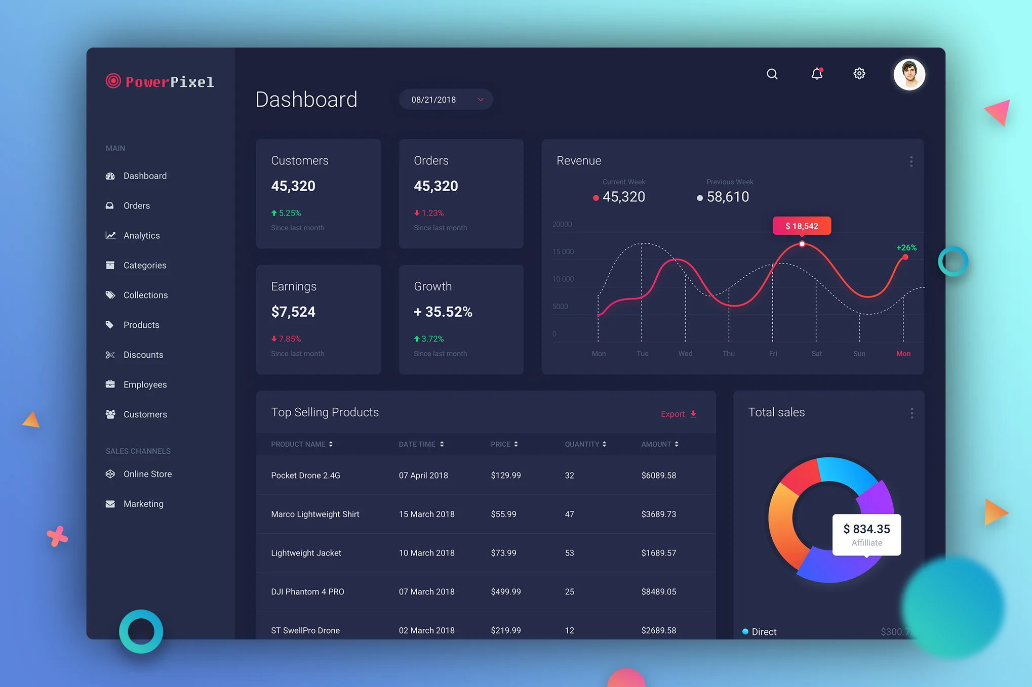

A Deep Dive into Elevation for Dark UI
Elevation in user interface design refers to the perceived depth of UI elements, giving them a sense of dimension on a two-dimensional screen. It’s a powerful tool to emphasize visual hierarchy and guide user interaction. While shadows effectively convey elevation in light mode, they often lack the subtlety required in dark mode. Here, the focus shifts from shadows to carefully managed colour variations, ensuring that the design remains both functional and visually soothing.
Why Choose Elevation Over Shadows in Dark Mode?
- Visual Comfort: Shadows can appear harsh in dark mode, disrupting the smooth experience. By leveraging colour variations for elevation, designs can maintain a balanced, harmonious feel.
- Natural Depth: Adjusting colour lightness rather than adding shadows mimics real-world lighting effects, providing a more intuitive, low-light experience.
- Consistent Hierarchy: Elevation through colour establishes a clear visual hierarchy, guiding users seamlessly and indicating which elements are interactive, primary, or secondary.
Creating an Effective Elevation System for Dark UI
To build a usable elevation system for dark mode, it’s essential to base each elevation level on gradual colour lightness changes. Here’s how to structure it:
- Start with a Comfortable Base Color: Avoid pure black (#000000) as it can strain the eyes. Opt instead for a deep grey or another dark tone (like #1E1F22) for a softer, more user-friendly base.
- Define Elevation Levels: Use 4–6 levels of lightness, with each level subtly lightening the base color. For example:
- Level 0 (Base): #1E1F22
- Level 1: #252629 (4% lighter)
- Level 2: #2C2D32 (6% lighter)
- Level 3: #323438 (8% lighter)
- Level 4: #393C41 (10% lighter)
- Assign Components to Elevation Levels: Map UI components to these elevation levels based on their prominence:
- Level 0: Main background
- Level 1–2: Buttons, cards, and small containers
- Level 3–4: Modals and primary interactive elements
- Level 5: Focus states and hover effects
Leveraging Primary and Accent Colors for Contrast
To ensure accessibility, use primary and accent colours that stand out against your dark base and elevated shades. A subtle accent colour, such as a muted blue or purple, can help create a balanced contrast.
Experiment with Hue Adjustments for Thematic Variations
If you wish to introduce a tint or match brand colours, try a slight hue shift across the palette. For instance, a cool blue tone can give a dark UI a cohesive, professional feel:
- Original Base: #202124
- Hue-Shifted Base: #202128 (for a subtle blue tint)
This can be easily managed in design tools like Figma by shifting the hue slider or adjusting lightness and saturation levels.
Sample Color Palette for Dark Mode UI
- Base: #202124
- Level 1: #252629
- Level 2: #2C2D32
- Level 3: #323438
- Level 4: #393C41
Conclusion: Elevation as a Guide in Dark UI
Effective elevation goes beyond creating depth; it’s about leading users through the interface naturally. In dark mode, where shadows are less impactful, mastering elevation through controlled color adjustments is vital for an engaging, intuitive experience. With these practices, your dark UI can feel as comfortable as a dimly lit room, providing users with a smooth, immersive experience.
