
The 2023 year was rich in technological innovations: we witnessed the introduction of virtual glasses from Apple, the surge of generative design driven by artificial intelligence, and foldable smartphones from Samsung. The web is now incorporating more and more bright and contrasting text. Micro-animations have become even harder to resist. Modern projects, like living entities, respond to every move you make.
Let’s take a look at what 2024 brings to us. Get comfortable, I’m Polina Korotkaya, a designer with the dev.family team, and I’ll tell you about the styles, techniques, and effects that will be in trend and why.
We will explore trends applicable to ordinary landing pages and simple image websites, as well as to online resources with more functionality, such as online stores, banking services, and other platforms with complex infrastructures or mobile applications.
3D graphics
3D illustrations continue to remain in trend. This is due to the increased performance of computers and the reduced cost of developing graphics of this kind.
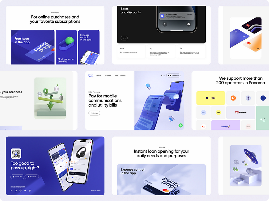
Another reason why large companies use 3D in their projects is that the images do not reflect the individual technique of a specific graphic designer. Therefore, almost anyone can draw 3D illustrations.
3D elements are often used for icons, buttons, and illustrations on websites and in applications. These elements attract attention with their non-standard appearance.
However, while volumetric shapes were enough to be “stylish” in the past, today, additional features like animation are required for the wow effect.
Three-dimensional graphics are most often seen in projects dedicated to fintech or Web3 and on the websites of digital companies. Firstly, it illustrates the necessary information better than others, secondly, it refers to the technological nature of the project, and thirdly, it sets the project apart from the rest.
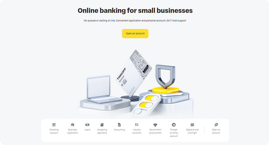
3D abstractions and imitation of real materials
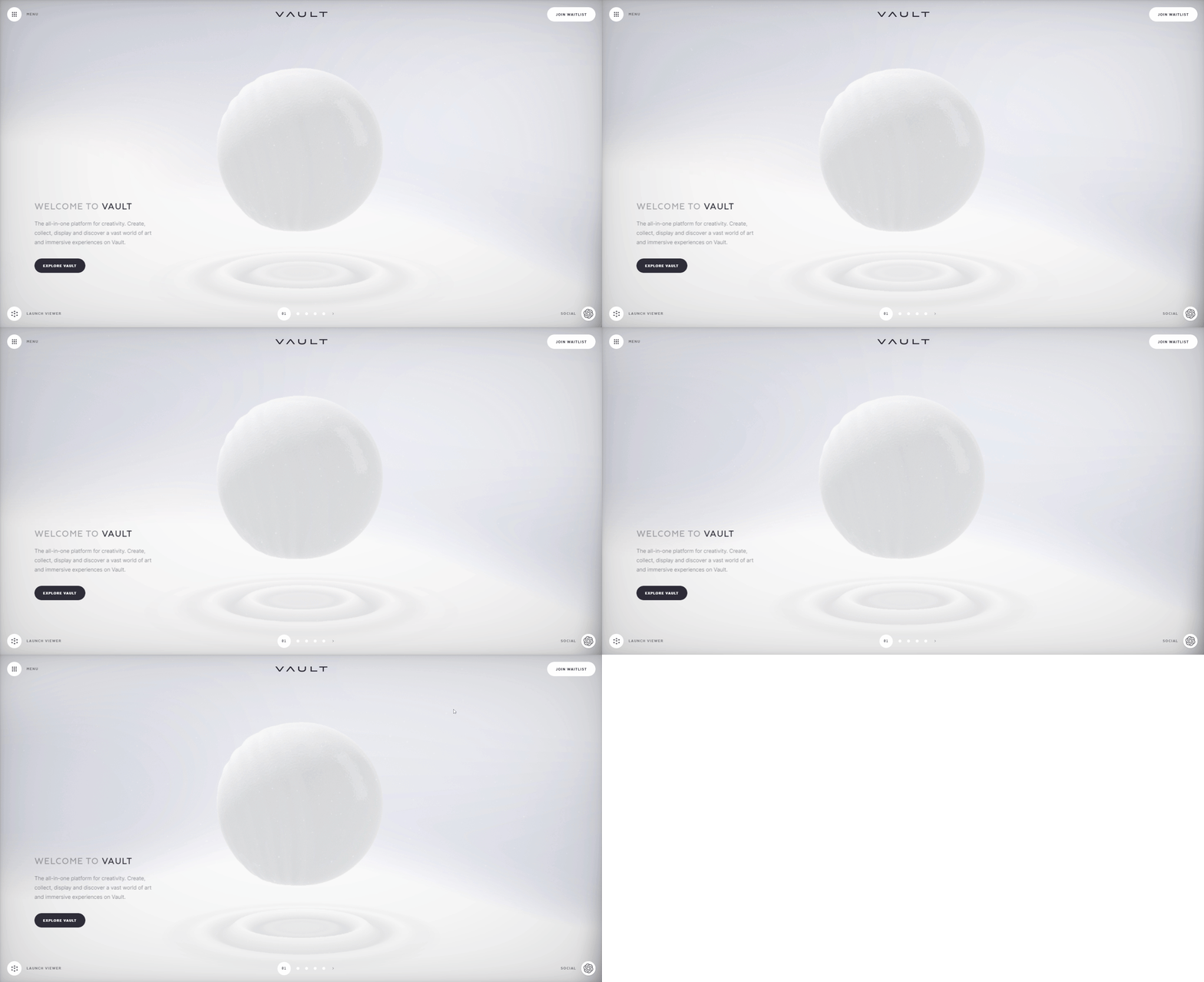
Abstract 3D forms are gaining popularity. This trend encompasses complex animated shapes, such as spiky spheres, and smooth surfaces made of numerous particles.
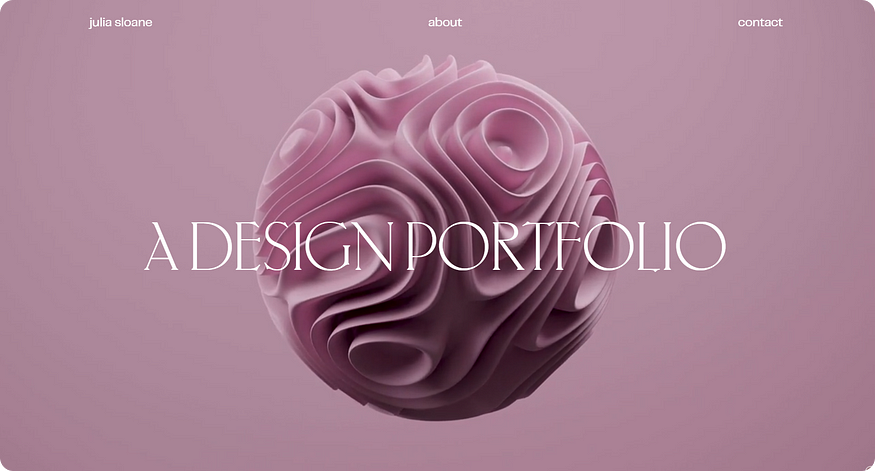
More often, such visuals can be found on the websites of creative or event agencies. The more elegant or, on the contrary, vibrant, the more attractive. Whether there are weddings, marketing, advertising, or influencer sites — all of them need to be on-trend. This is an excellent way, without diving into various missions and goals, to showcase their creative component. It evokes emotions ranging from “aww, how cute” to “wow, that’s mind-blowing.” It helps gather people with similar thinking and values, thus filtering out an incompatible target audience.
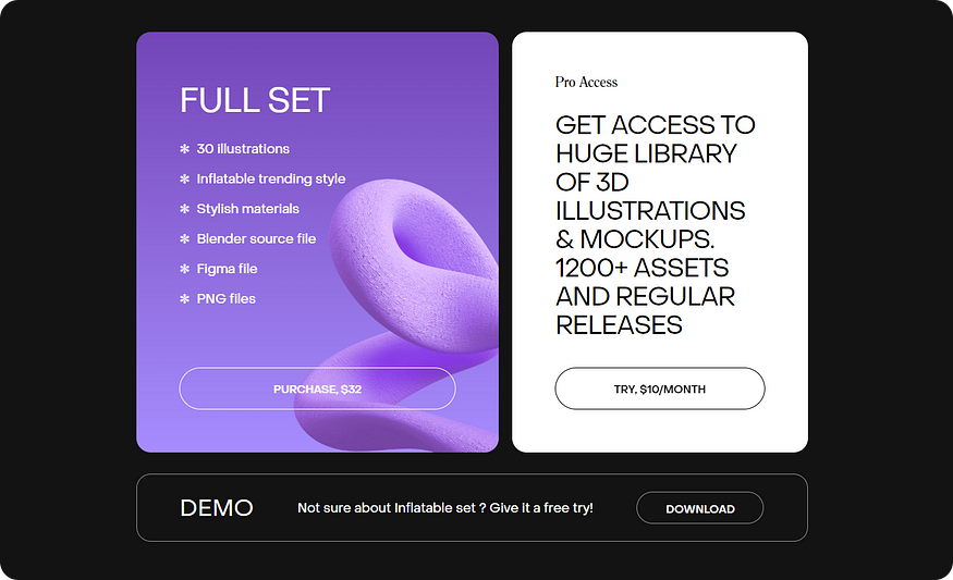
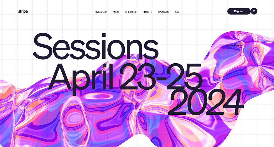
But keep in mind that, it’s worth considering that adding such graphics can increase the website’s loading speed. And in mobile applications, interacting with such an interface can be inconvenient.
Real 3D objects
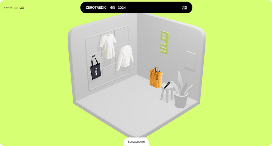
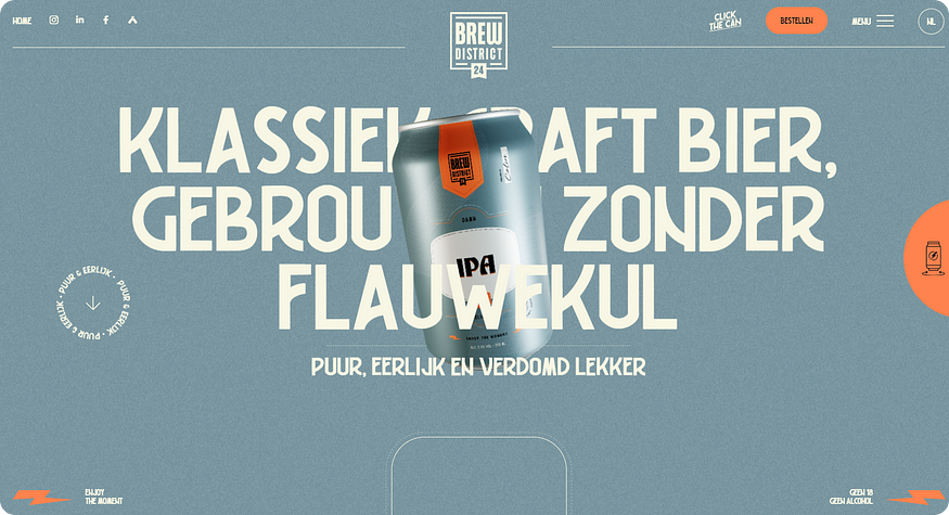
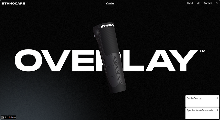
One of the ways to engage with the audience is to create a 3D version of your products. Such a website becomes highly interactive, providing users with a new experience and initial impressions of the brand.
Complex gradients
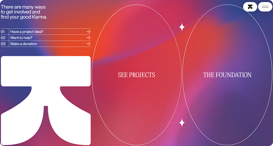
Complex gradients will continue to be relevant in 2024, alongside 3D abstractions. It can be said that these two trends will go hand in hand as they complement each other well. Together, they add even more realism to the interface.
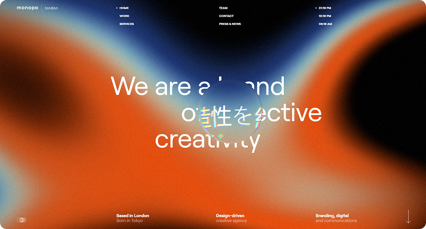
This technique is relevant if your project is dedicated to Web3 or digital products. With it, you’ll get a bright and futuristic product, creating a strong association with something modern and highly technological. Allow users to touch the future and feel a part of it.
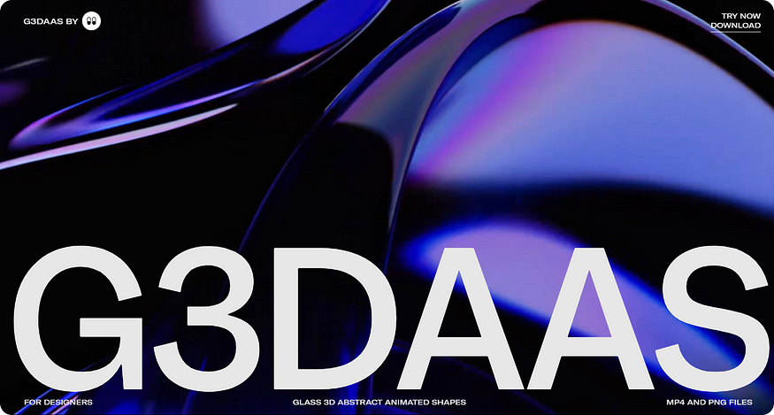
Glassmorphism and neumorphism
Glassmorphism and neumorphism are two trends that emerged back in 2020 (with glassmorphism dating back to iOS 7 in 2013). They sparkled, faded away, and then, in 2024, made a comeback. Why?
The visual with elements of neumorphism and glassmorphism adds realism to interfaces. This approach is popular among digital companies whose main goal is to showcase their products. Users should feel like they are examining an object up close, seeing its texture, and virtually “touching” it with their eyes. This creates a strong association: “I held this in my hands, so it exists, and it’s almost mine.”
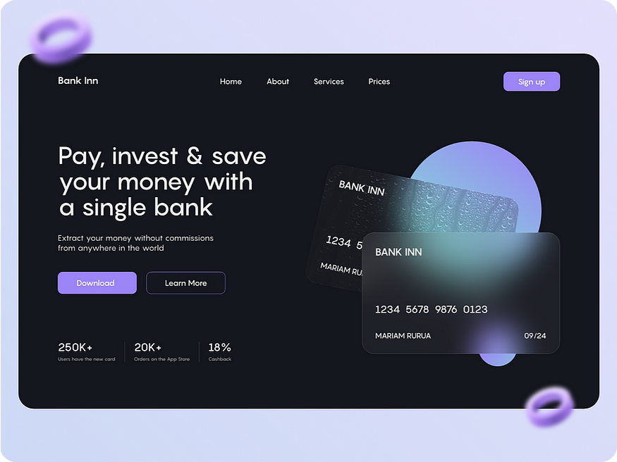
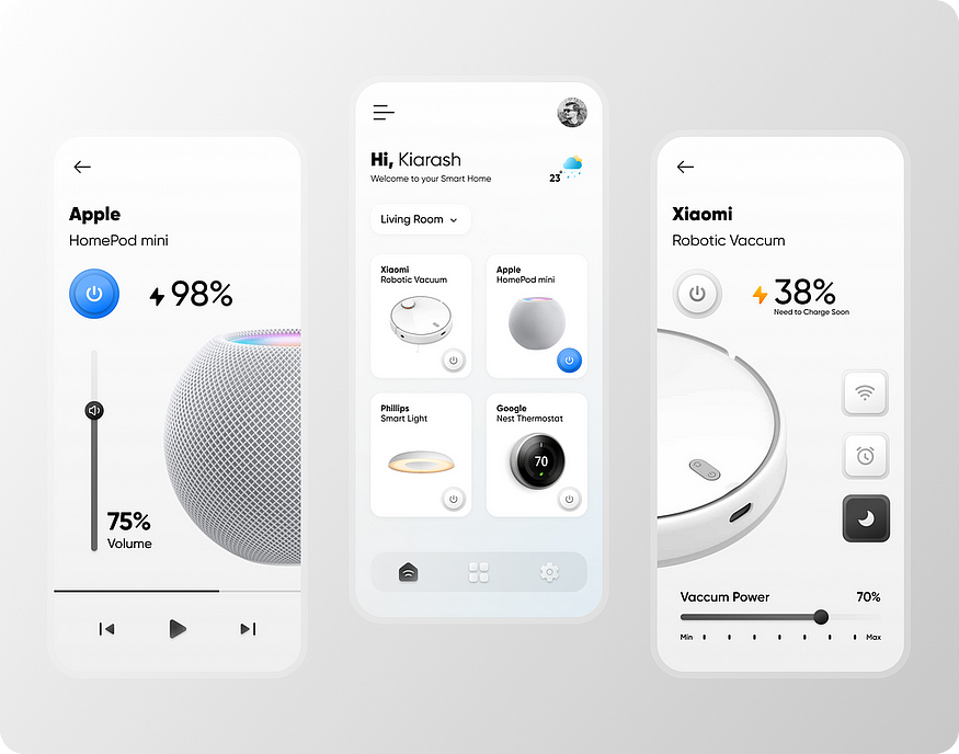
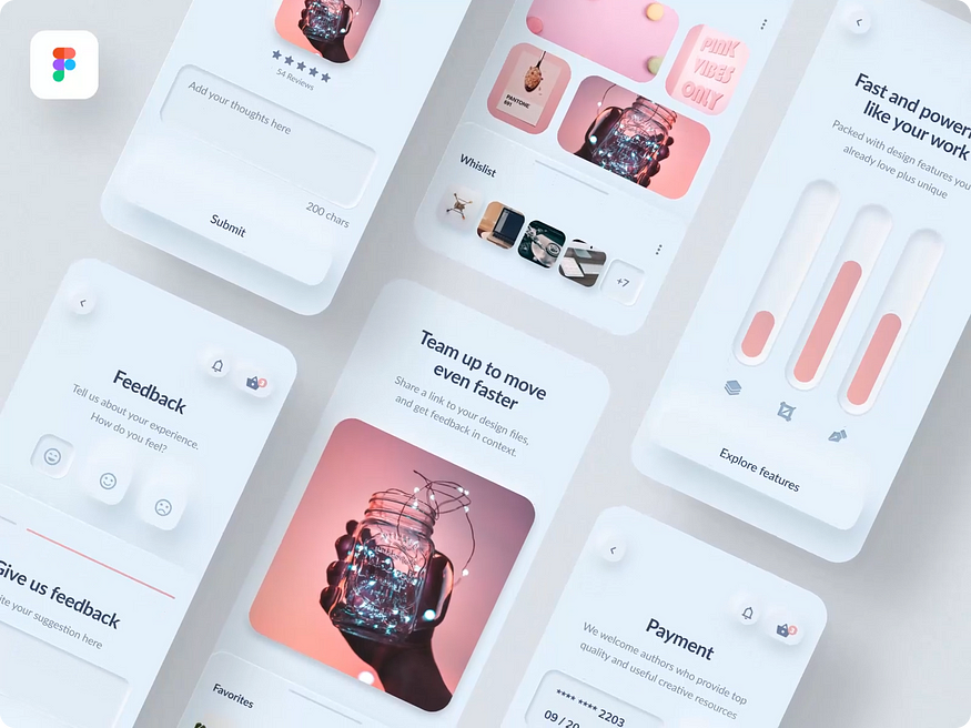
A bit of clarification:
Glassmorphism is the imitation of glass-like elements in interfaces.
Neumorphism is an adapted trend derived from skeuomorphism, tailored to modern aesthetics. It emphasizes high-quality shadow rendering on objects, volume, and gradients.
Low poly illustrations
It is worth mentioning the return of the trend towards low-polygon graphics. Such illustrations are laconic and effectively convey information through simple shapes. Creating a sketch, setting the scene, and placing a person in certain conditions, alike to a game, can evoke a sense of nostalgia, pleasant memories, and feelings of lightness and carefreeness.
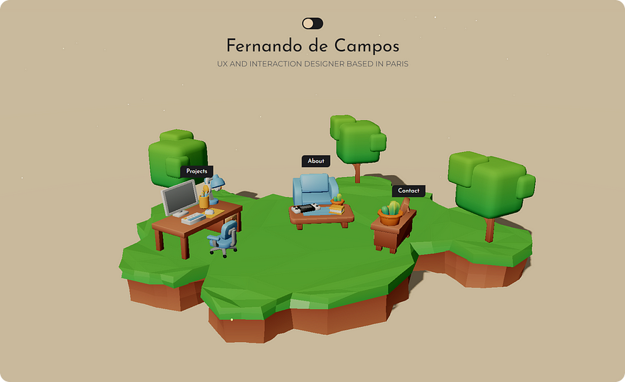
Some companies go even further and create captivating platforms where users can either play mini-games or participate in real quests online. This is related to people’s love for achievements and various rewards. Everyone wants to win, even if it’s in a virtual world. On the other hand, the brand gains an engaged and motivated user who can be inclined towards making a purchase by rewarding them with a discount, bonus, or coupon.
https://cdn.embedly.com/widgets/media.html?src=https%3A%2F%2Fwww.youtube.com%2Fembed%2Ffe6jiYDT5JE%3Ffeature%3Doembed&display_name=YouTube&url=https%3A%2F%2Fwww.youtube.com%2Fwatch%3Fv%3Dfe6jiYDT5JE&image=https%3A%2F%2Fi.ytimg.com%2Fvi%2Ffe6jiYDT5JE%2Fhqdefault.jpg&key=a19fcc184b9711e1b4764040d3dc5c07&type=text%2Fhtml&schema=youtube
2D illustrations
In 2024, linear and hand-drawn illustrations continue to exist. Today, major companies choose them to create and maintain their unique style. Examples to look at are Google, Yandex, Dropbox, Mailchimp, and Wetransfer.
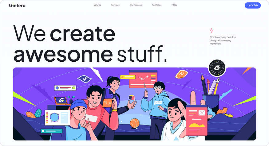
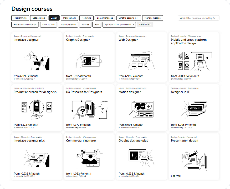
Indeed, hand-drawn illustrations are the most common tool for storytelling, allowing brands to tell and show their story to users. This is a reference to children’s books, pleasant evenings, and personal narratives. The brand thus gets close to the user, showing that the conversation will be in the same language.
Minimalism and «simple simplicity»
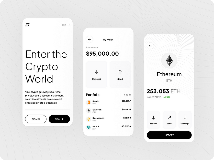
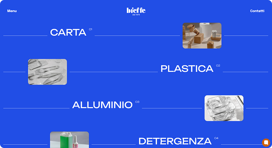
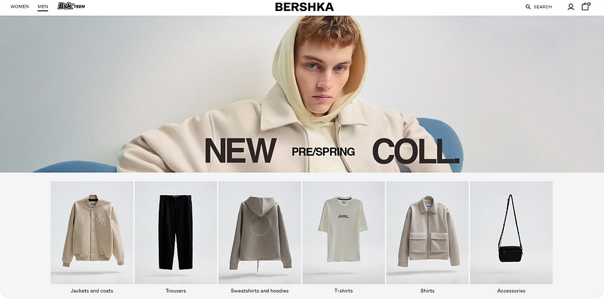
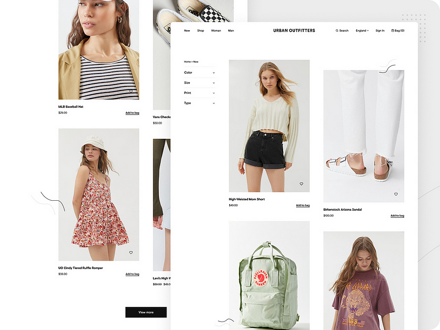
As the antithesis to animated interfaces, minimalism, which remains relevant in 2024, continues to evolve. It is widely used in projects offering interior design services, legal services, and e-commerce. In e-commerce, in particular, the preference is not to indulge in bright details because the user needs to focus on the essentials rather than be distracted by an abundance of decorative elements.
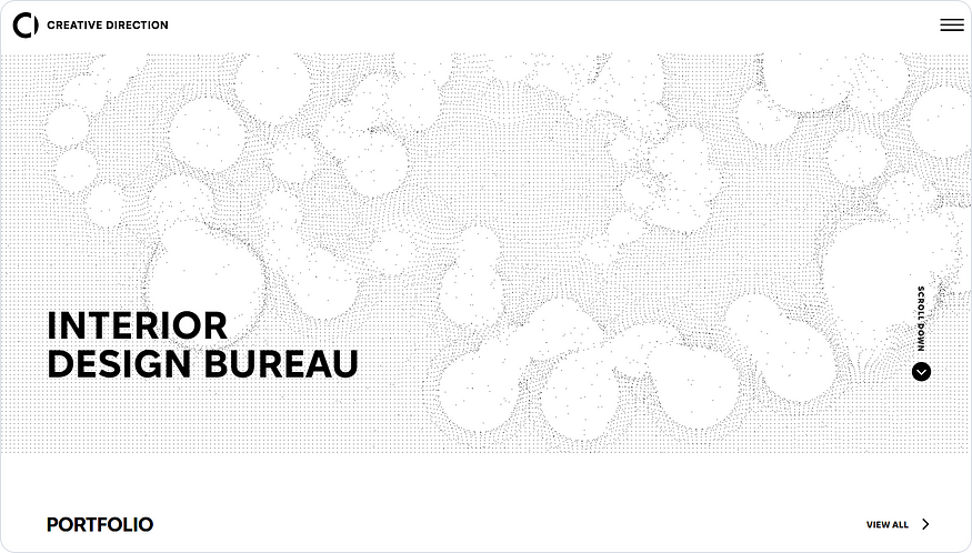
This time, attention should be paid to websites with a block system, a large amount of negative space, and contrasting fonts.
Clean design in complex interfaces
Minimalistic design is especially in demand in complex interfaces that contain a large amount of data. For example, such projects can include dashboards, personal accounts, and sometimes online stores.
This approach helps the user to quickly understand and start using the product, while an abundance of graphics and colors would only distract from the main goal.
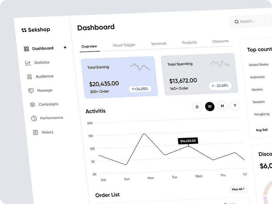
Since complex interfaces are our expertise, we would love to share and demonstrate more, but instead of a thousand words, we invite you to take a look at a case study for the largest polymer producer in Eastern Europe.
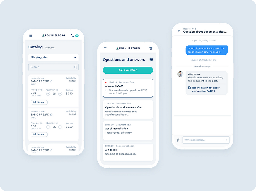
They required a personal account to reduce the workload on managers. Thanks to this solution, small and medium-sized businesses (constituting 80% of clients but generating only 20% of profits) can now independently place orders, receive necessary documents, and monitor the delivery schedule. Meanwhile, salespeople can focus on large businesses, comprising 20% of clients but contributing a whopping 80% of profits.
Monochrome
Monochromatic design continues to exist. It can be of various colors, but typically, it is always devoid of unnecessary details.
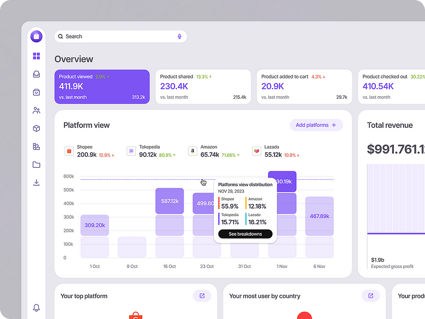
This design without standout elements that distract attention creates a sense of “order.” You might think, “Wow, it’s so neat!” and begin to trust it, perhaps even feeling confidence in the product.
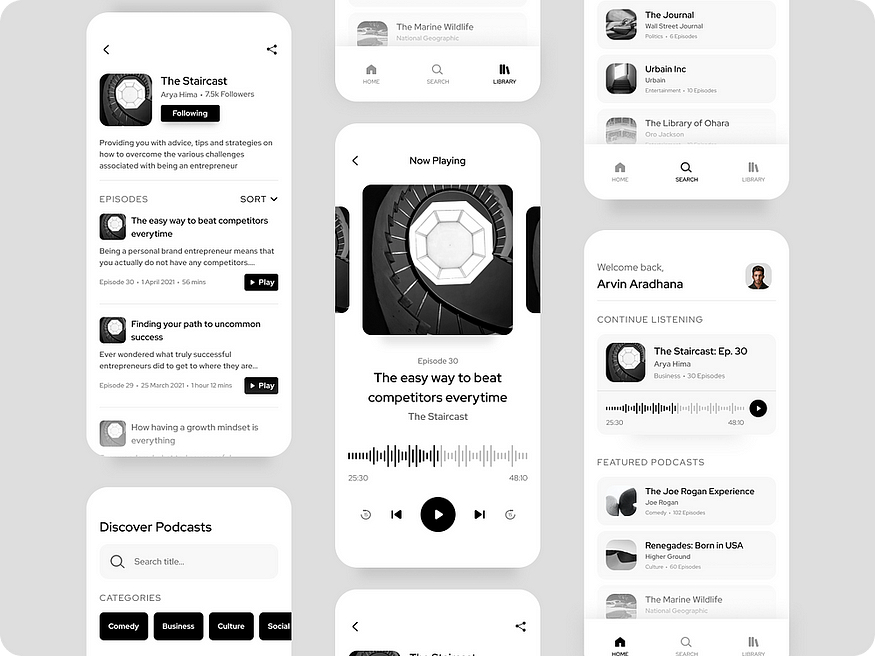
The dark futuristic interface
The dark interface has evolved into something more than a simple choice between “light mode” and “dark mode.” It captures the user’s attention with its premium feel, distinctively standing out from the usual content on a white background.
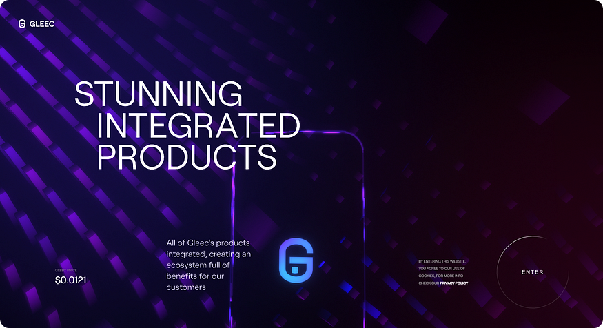
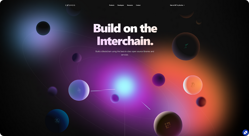
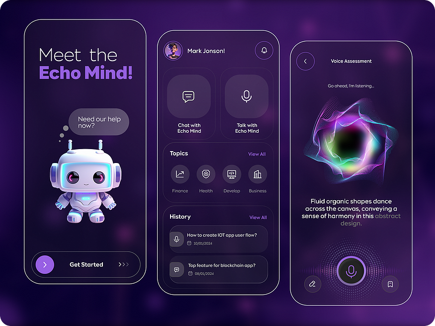
Such a style creates a special cosmic atmosphere and adds a touch of luxury. Therefore, a dark theme is often found in premium banking products, closed communities in the info business, VIP services, and goods. It effectively emphasizes high status and the progressive nature of the technologies used.
Animations
They were here. They are here. They will be here! But which ones are considered trending?
Micro-animations
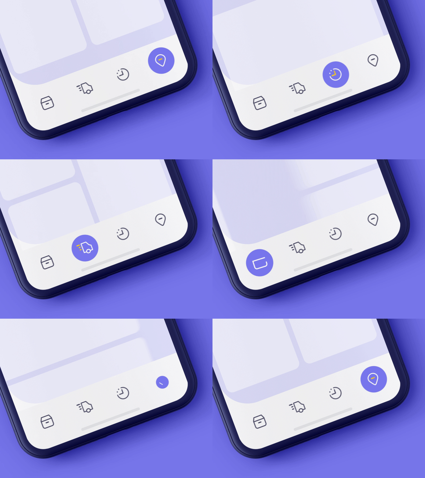
Interactive interfaces are probably the best idea in the world of design. Micro-animations help guide users to achieve their goals, facilitate navigation on the website, and speed up the accomplishment of tasks. Animated elements indicate the direction of actions, provide clear instructions on where to go and what to do. As a result, users don’t need to guess, and we gain a plus in karma.
https://cdn.embedly.com/widgets/media.html?src=https%3A%2F%2Fwww.youtube.com%2Fembed%2FRHcENBTcinA%3Ffeature%3Doembed&display_name=YouTube&url=https%3A%2F%2Fwww.youtube.com%2Fwatch%3Fv%3DRHcENBTcinA&image=https%3A%2F%2Fi.ytimg.com%2Fvi%2FRHcENBTcinA%2Fhqdefault.jpg&key=a19fcc184b9711e1b4764040d3dc5c07&type=text%2Fhtml&schema=youtube
Text
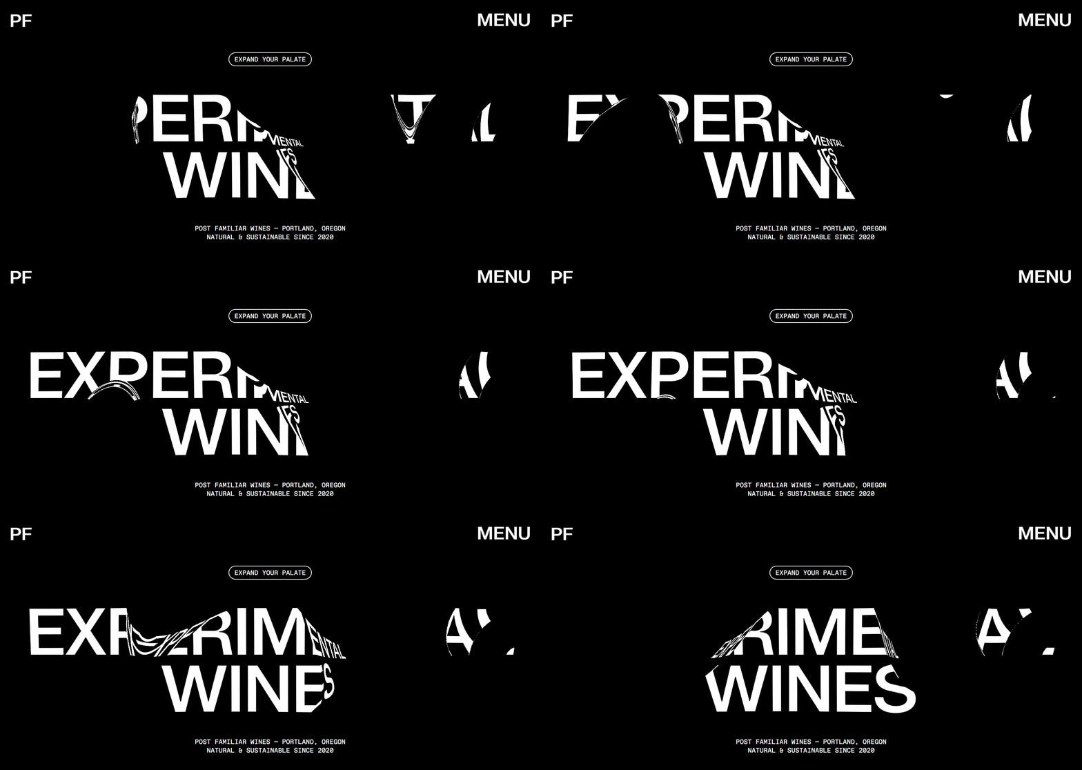
More specifically, kinetic typography. This is an animation technique that combines movement and text. It allows for the creation of interesting and dynamic interfaces to convey or evoke unusual thoughts or feelings. Kinetic typography utilizes various styles, technologies, and effects such as video, audio, animation, graphics, and games. It is applied to design headlines, titles, advertisements, music videos, educational materials, and other types of content.
https://cdn.embedly.com/widgets/media.html?src=https%3A%2F%2Fwww.youtube.com%2Fembed%2FyiXtat7XJ08%3Ffeature%3Doembed&display_name=YouTube&url=https%3A%2F%2Fwww.youtube.com%2Fwatch%3Fv%3DyiXtat7XJ08&image=https%3A%2F%2Fi.ytimg.com%2Fvi%2FyiXtat7XJ08%2Fhqdefault.jpg&key=a19fcc184b9711e1b4764040d3dc5c07&type=text%2Fhtml&schema=youtube
Super interactive
In addition to micro-animations, websites that “transport” users into virtual reality are becoming popular. There, users can explore the life and characteristics — practically with the entire world of the brand. This allows people to adopt the values, mission, and become advocates for the brand.
https://cdn.embedly.com/widgets/media.html?src=https%3A%2F%2Fwww.youtube.com%2Fembed%2FhUuQGm8L92E&display_name=YouTube&url=https%3A%2F%2Fwww.youtube.com%2Fwatch%3Fv%3DhUuQGm8L92E&image=http%3A%2F%2Fi.ytimg.com%2Fvi%2FhUuQGm8L92E%2Fhqdefault.jpg&key=a19fcc184b9711e1b4764040d3dc5c07&type=text%2Fhtml&schema=youtube
https://cdn.embedly.com/widgets/media.html?src=https%3A%2F%2Fwww.youtube.com%2Fembed%2FewqmezhPqNs%3Ffeature%3Doembed&display_name=YouTube&url=https%3A%2F%2Fwww.youtube.com%2Fwatch%3Fv%3DewqmezhPqNs&image=https%3A%2F%2Fi.ytimg.com%2Fvi%2FewqmezhPqNs%2Fhqdefault.jpg&key=a19fcc184b9711e1b4764040d3dc5c07&type=text%2Fhtml&schema=youtube
https://cdn.embedly.com/widgets/media.html?src=https%3A%2F%2Fwww.youtube.com%2Fembed%2F0Mq1gtHaV60&display_name=YouTube&url=https%3A%2F%2Fwww.youtube.com%2Fwatch%3Fv%3D0Mq1gtHaV60&image=http%3A%2F%2Fi.ytimg.com%2Fvi%2F0Mq1gtHaV60%2Fhqdefault.jpg&key=a19fcc184b9711e1b4764040d3dc5c07&type=text%2Fhtml&schema=google
https://cdn.embedly.com/widgets/media.html?src=https%3A%2F%2Fwww.youtube.com%2Fembed%2FsuC3o141tB0%3Ffeature%3Doembed&display_name=YouTube&url=https%3A%2F%2Fwww.youtube.com%2Fwatch%3Fv%3DsuC3o141tB0&image=https%3A%2F%2Fi.ytimg.com%2Fvi%2FsuC3o141tB0%2Fhqdefault.jpg&key=a19fcc184b9711e1b4764040d3dc5c07&type=text%2Fhtml&schema=youtube
Among the pitfalls, we would highlight the challenging development and promotion in search engines. The crucial aspect here is not just the text but the visual component.
Characters
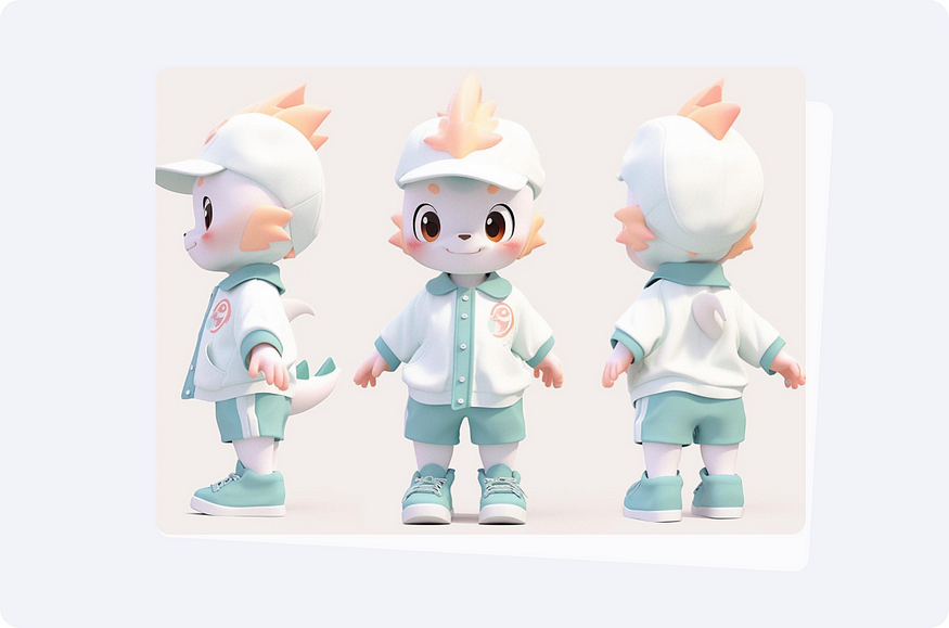
To captivate users even more, consider using unique mascot characters. They accompany users while using the digital product and engage them in interaction. This approach helps stand out from competitors, ensures consistent communication (users find it easier to adapt if they encounter a familiar character on each platform of the brand or company).
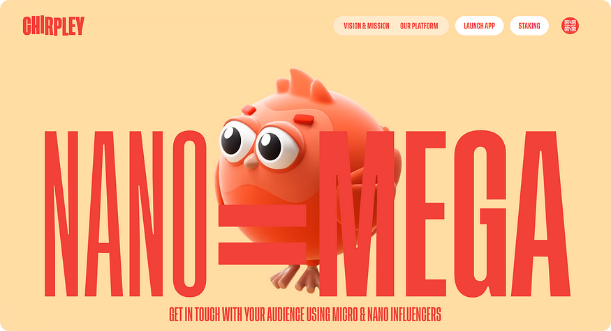
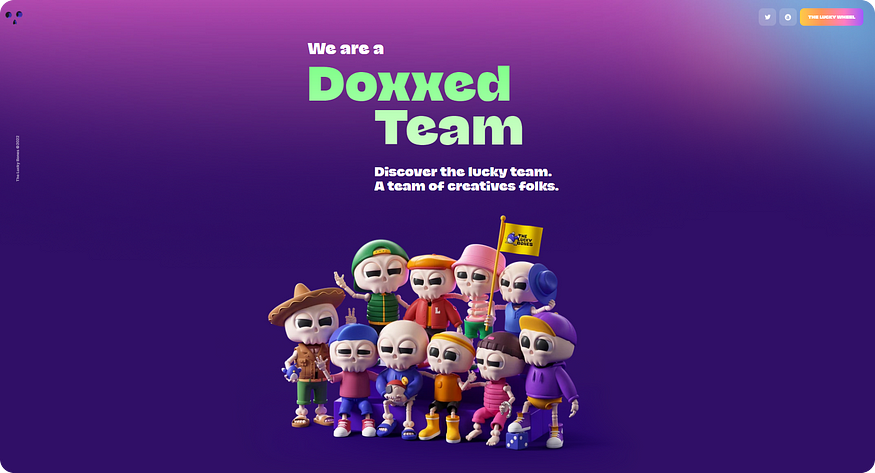
Characters in the interface serve several purposes:
- Characters act as guides, providing assistance, hints, and encouragement to users. They help users navigate through the interface and understand the features of the product.
- Characters contribute to establishing an emotional connection with the audience. They convey the values of your product and make the interaction more engaging by adding a personal touch.
- Users may receive bonuses, discounts, or other rewards through the character. This ties into the broader trend of gamification, where users can earn achievements by completing tasks.
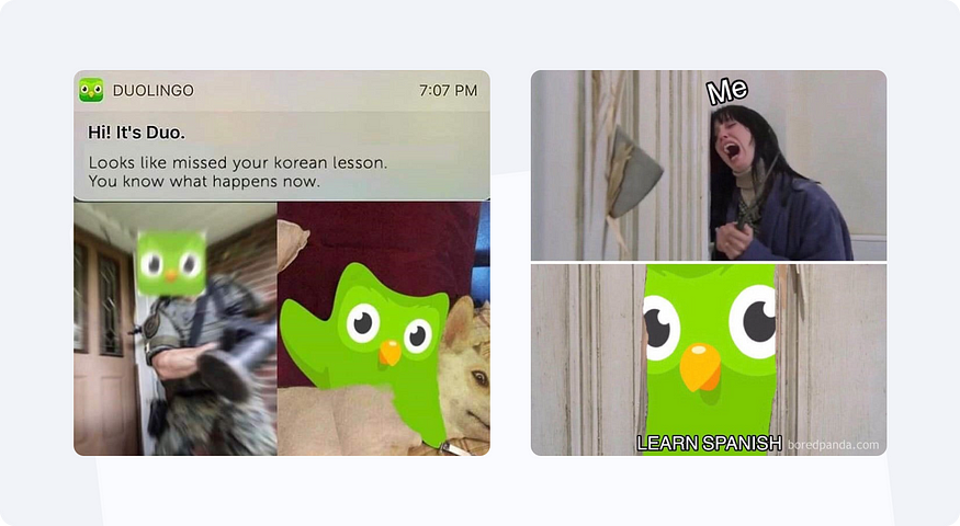
In some cases, characters become so unique and beloved that they turn into memes. This was exemplified by the Duolingo owl, which became a widely recognized and humorous element associated with the language learning platform.
Good Old Memories
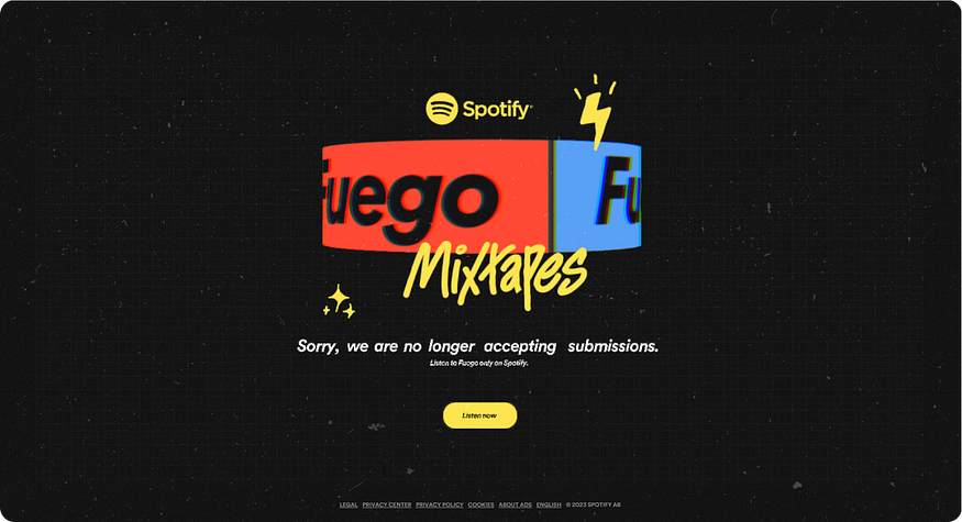
Elements of retro and vintage design are excellent triggers that evoke nostalgic feelings among users. They engage users in emotional interactions with the product, providing an immersive experience. Subconsciously, they strengthen visitors’ trust, conveying a message like, “We share a common past, shared memories. We grew up together.”
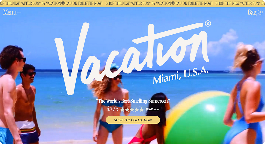
Use retro elements in your projects if you know that your target audience correctly recognizes and interprets them.
How to do it? Add characteristic elements: calligraphy and antique fonts, old photos, pop art. Fonts can be handwritten and in a lettering style. Techniques can be mixed.
Pixel art
Techniques reminiscent of early video games and 8-bit style graphics are skillfully incorporated and blended with other styles in projects related to food tech, event organization, creative agencies, or personal portfolios.
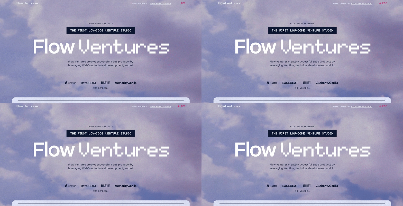
However, it’s advisable to use them with caution if you are sure that such visuals will be relevant to your audience and that they will understand the reference.
Bold Experimental Design
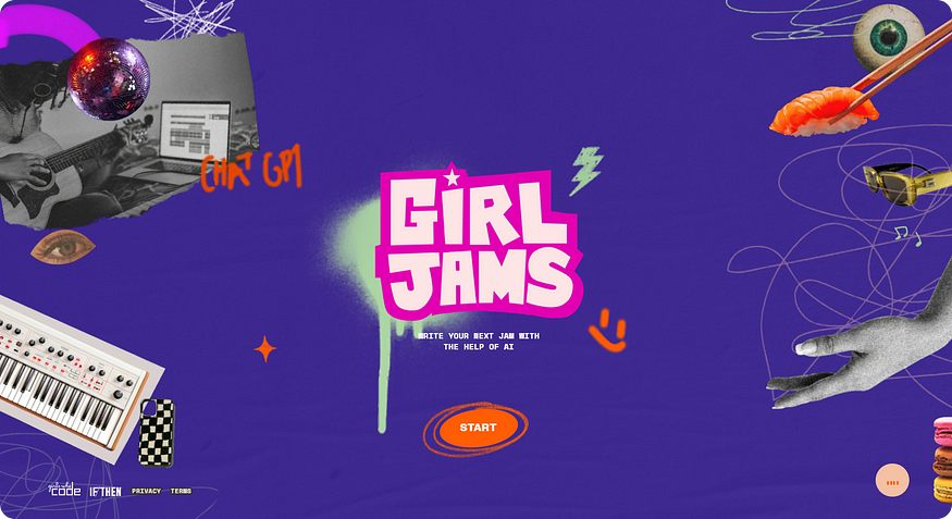
Saturated typography, acid colors, GIF animations, scrolling text, as well as bright but flat collages, elements from Mac OS 9, Windows 2000, and Windows ME — all of these are used when you want to create a truly “wild” and memorable visual.
This is an excellent approach if you want to quickly grab attention for your event or project. However, it’s unlikely to be a good solution if you’re selling kitchenware or creating a website for a veterinary clinic.
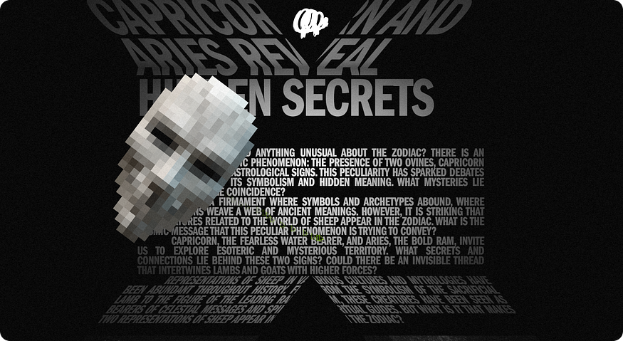
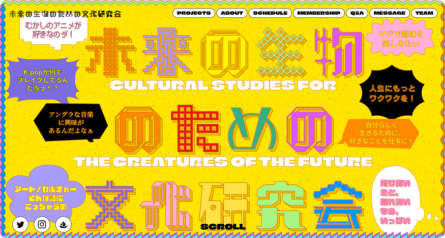
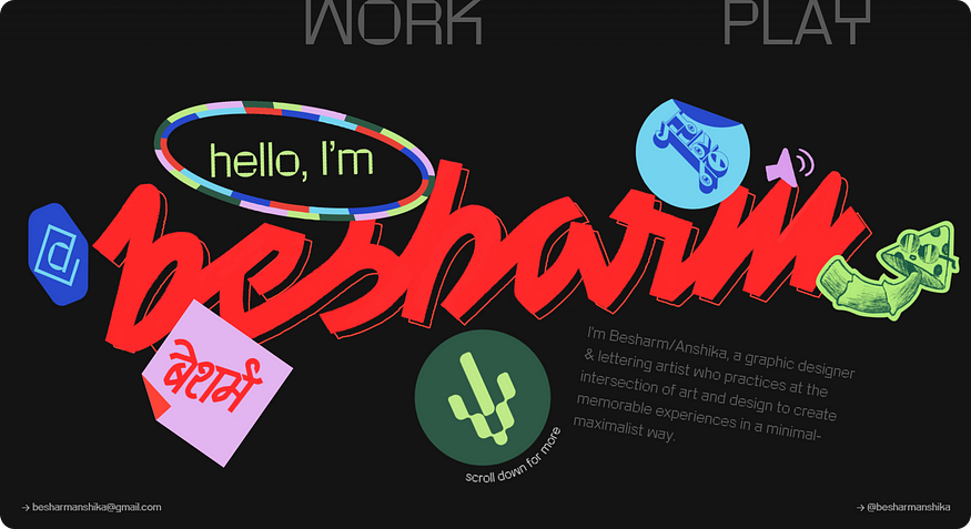
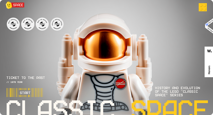
The main goal is to impress the user, everything else is secondary. Therefore, it is worth using all these bold techniques if your project is dedicated to informal organizations and events.
Ubiquitous AI
As a bonus, I’ll tell you about my favorite tool that can be used for both simple and complex websites. I’m talking about Artificial Intelligence. We’ve become quite engrossed in this technology, integrating it into our workflows, and offering it to clients. Most importantly, we keep an eye on trends and show how it can and should be used in “everyday life.” We’ve written about how AI helps the restaurant business and HoReCa, and here we talked about AI and e-commerce.
As for designers, they have certainly felt the strong advantage of implementing artificial intelligence: working on visuals used to be measured by days of work, and now it takes a couple of hours. How else can AI be used?
Content
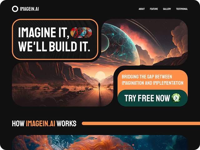
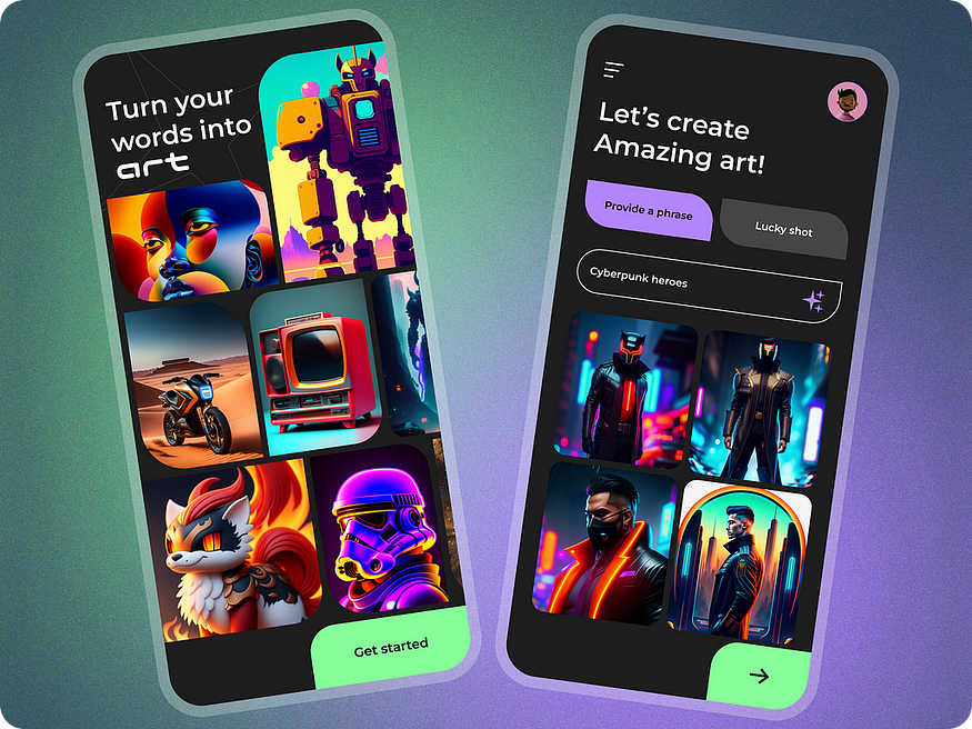
One of the problems with newly launched projects is the lack of sufficient content. Text and image neural generators (I’m referring to chatGPT, Midjourney, and similar companies) help fill unplanned gaps on the website in a short amount of time, making it more appealing to users.
Interactive backgrounds and images
Interactive backgrounds and images have been actively developing since the middle of 2023, with services for creating animated content seeing significant growth.
https://cdn.embedly.com/widgets/media.html?src=https%3A%2F%2Fwww.youtube.com%2Fembed%2F42E7tiq7D0k%3Ffeature%3Doembed&display_name=YouTube&url=https%3A%2F%2Fwww.youtube.com%2Fwatch%3Fv%3D42E7tiq7D0k&image=https%3A%2F%2Fi.ytimg.com%2Fvi%2F42E7tiq7D0k%2Fhqdefault.jpg&key=a19fcc184b9711e1b4764040d3dc5c07&type=text%2Fhtml&schema=youtube
Characters
The characters mentioned above can be either hand-drawn, requiring a significant amount of time and coordination at each stage of the process, or quickly generated in large quantities with less effort to come up with something specific.
If you’ve decided to create a website or are contemplating a redesign
Following trends, do not forget about measure and convenience — it’s most important to help the user quickly get all the important information and perform the target action. Therefore, always ask yourself the question, “Why am I drawing this?”
When planning to create an online store, a complex platform with a personal account and different levels of access, a project to automate some business processes, remember: first, solve functional tasks, and second, add beauty.
Consult with people who have relevant experience. A designer who created a landing page is unlikely to think through all the nuances when creating a store. And certainly, if someone designed business cards for you, they are unlikely to develop a good personal account. If you find specialists directly from your industry (foodtech, fintech, fashion, etc.), you won’t have to think about everything yourself.
Source : Medium by dev.family
