
Common portfolio mistakes that immediately make designers unhirable (and how to fix them)

You need a wake-up call and this is it. I received such a call many years ago when my doctor offered me tranquiliser pills so that I could go back to a highly stressful job. Despite not having a college degree in design, I had dreamed about being a designer while I was stuck at a corporate job at a local bank. By all standards, it was a fancy job that others would have killed for — they interviewed 130 candidates for it but in the end, I got it. 18 months later I couldn’t cope anymore.
If I wanted to be a designer, I needed to commit to it 100% and put all my remaining energy into finding a full-time design job which was extremely hard in the early 2010s, especially for a self-taught designer. I worked 13 hours per day (8 at work and an additional 5 at home on freelance projects), and I worked all the weekends. The only way to build a portfolio was to work on as many freelance projects as possible. I designed and redesigned my portfolio three times and rewrote my case studies. Eventually, I received an offer to join a Luxembourgish startup.
The same thing happened again when I worked as a Lead Designer in London. It had been a while since I designed my portfolio and wrote case studies so I needed to relearn how to do it well. Again, I wrote and rewrote the case studies and redesigned my portfolio three times to finally get it right. It was tough, but I pushed through it.
Designing a portfolio and writing case studies is extremely hard, especially because most designers need to do it on top of their full-time jobs. Lately, however, there has been a convenient excuse for a lot of them.
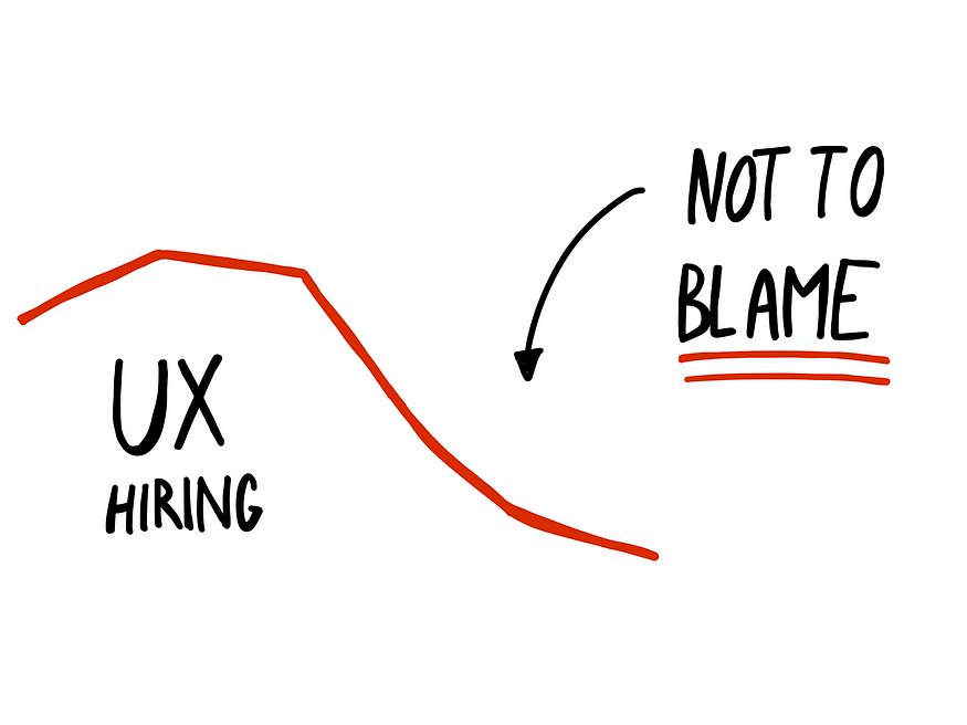
Everyone keeps talking about how terrible the UX job market is right now. But how come so few of us talk about the proliferation of low-quality portfolios? The UX hiring isn’t as bad as many would like you to believe, or as you’d like to make yourself believe. At worst, it was at 65% of the 2021 baseline (Source), which was at the peak of mass layoffs. Take a look at the bigger picture (Fig 1) and you’ll see that hiring in tech has skyrocketed since 2018 with hiring surges of up to 200%. While a 71% drop in UX design openings from 2022 to 2023 seems shocking, that’s only a 23% decrease comparing 2018 to 2023 (Source).
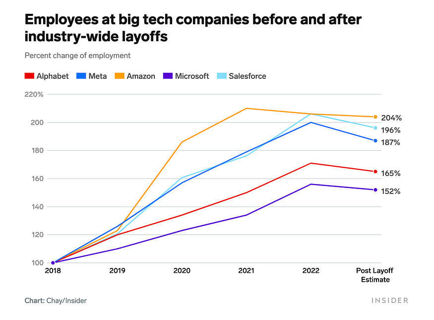
Despite perceptions of saturation, the UX job market remains strong, with continued demand for skilled professionals across various industries. (Source)
So your wake-up call is this: Is it really the job market’s fault for not getting a job or is it your lack of effort?
Maybe I’m a bit too harsh. The reality of why a portfolio fails to get you job interviews could be one of these:
- Inexperience and lack of knowledge in designing portfolios: Designers who are designing their portfolios for the first time or after a while and make genuine mistakes.
- Use of poor templates and platforms: These often result in cookie-cutter portfolios that all read the same.
And when it comes to designers and their attitude towards their job, their craft, and their portfolios there are these groups:
- Sloppy, grumpy, and wrong attitude: Designers who don’t care about the craft of design and don’t put enough effort into crafting their portfolio.
- Enthusiastic and wrong attitude: These designers love the craft of design but dislike putting effort into crafting their portfolios.
- Enthusiastic and right attitude: These designers love everything about design, including crafting their portfolios. However many make mistakes due to a lack of experience or knowledge on creating a good portfolio. Or maybe they use shitty, cookie-cutter templates.
I want to help designers from the second and third groups with this article because there are a lot of them. Full disclosure, I used to be a designer from the second group: I loved the craft of design but absolutely hated working on my portfolio. Until I learned to embrace and love it, which helped my career tremendously. Before we get to portfolio mistakes and changing your attitude, let’s first take a quick look at how portfolios and case studies are reviewed.
Reviewing portfolios is a process of elimination
I was in lead and senior positions for many years in my career during which I reviewed more than 1,000 portfolios. Reviewing portfolios is a process of elimination where the manager tries to eliminate the majority of them very quickly. That’s harsh, but what are they supposed to do when they have to review more than 100 job applicants with the limited time they have?
Most of them don’t make it through the 30-second cut, those that do get a couple of minutes of their attention. To help me get through that many portfolios, I started noticing common mistakes that would eliminate a designer almost immediately.
A designer that I mentor sent me the feedback he received when he got rejected for a recent job opening. The hiring manager admitted that out of more than 100 applications, “90% of them were crap.” Imagine being that hiring manager and going through the hiring process multiple times and reviewing hundreds of applications each time. The first thing you’d want to do is eliminate those 90%.
But a lot of those 90% can be improved if designers avoid common mistakes and change their attitude towards crafting their portfolios. More on that later, now let’s look into these mistakes.
Common portfolio mistakes that will get you rejected almost immediately
Cramming all your work in your portfolio
This is a sign of an inexperienced designer. You do lots of things, have posts on Dribbble and Behance and a couple of case studies. So you want to show off your versatility and cram all those things in your portfolio.
The problem with that is that it overwhelms the managers, they don’t know where to look and what to read. Focus on 2–3 pieces instead and write somewhat detailed case studies on those. If you want to get hired as a UX/Product designer, stop showing your Dribbble shots next to your case studies. You can still link to your Dribbble account, but subtly, like including a link in the footer of your website.
Not establishing context in case studies
Here’s the first paragraph of a case study I recently reviewed:
Company name, an AI-powered platform that assists ITOps teams in preventing, managing, and resolving IT incidents, aims to enhance its outbound integration feature and add self-service capabilities.
What’s ITOps? What’s outbound integration in this case? What do you mean by self-service capabilities? If I don’t understand what you’re talking about, you already lost me. Reviewing the rest of the case study will be really hard for me and I’ll be much more likely to reject it. Here’s the polar opposite, a great example of establishing context:
Picture yourself as the CEO of a well-known startup company that has been growing exponentially in recent months. Unfortunately, your company is outgrowing your fraud management solution and you are using too many fraud prevention vendors to protect your clients and gaps in your solution are being taken advantage of by fraudsters.
The private information of your clients is in danger and you are at risk of losing your customers and revenue by damage to your reputation.
Anyone can understand the situation described above. After this intro, I’m excited to see what the solution was. What did the designer come up with?
You’re not telling the story to yourself but to someone who has no idea about the work, the workplace, or the company. Keep that in mind.
“Fake it ‘till you make it” or being too shy
Some designers try to overcompensate for their lack of skills by sounding more confident in their case studies. They’ll boast about their achievements that on closer inspection fall apart into regular, or even sub-par, design work. Maybe they make the 30-second cut, but as design managers dig deep they spot these problems and often reject these portfolios.
On the other hand, some shy designers go along with what others tell them to do. In a case study that I reviewed recently, I read about a designer’s approach to collaborating with their colleagues and how they didn’t even try to establish a human-centred design process: There was no point in trying to change that here. And to some degree they were right–they were experts and knew what they wanted to communicate about the place.
In that sentence alone, I recognised the lack of confidence and leadership in this designer. I poked them about it and they admitted that it was partly true but that sentence made it sound worse than it was.
Be careful about the language that you use. If you’re a shy person, keep that in mind as you write your case studies. If you’re a “fake it till’ you make it” type of person, try not to boast but distance yourself from your work and describe it realistically and objectively.
Using complex language, trying to sound smarter
Do you know what this means? “The delay in improvement stems from the feature’s complexity and users’ inability to perform it without customer success assistance.” I had to read it twice to get it. Managers only skim through case studies, they won’t be reading it twice. Rewrite it to: “The improvements were delayed because the feature was complex and the users weren’t able to use it without customer support.”
Randomly placed imagery
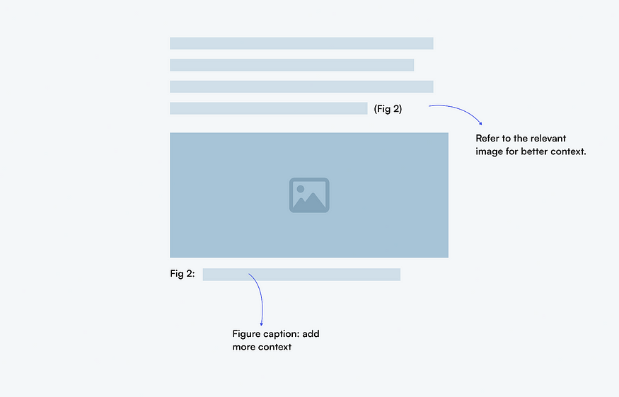
In every post that I write about portfolios and case studies, I complain about low-resolution imagery and yet it still keeps coming up as an issue when I review portfolios. The only thing that’s worse than low-resolution images in a case study is low-resolution images that are randomly placed throughout, without caption or context (Fig 2).
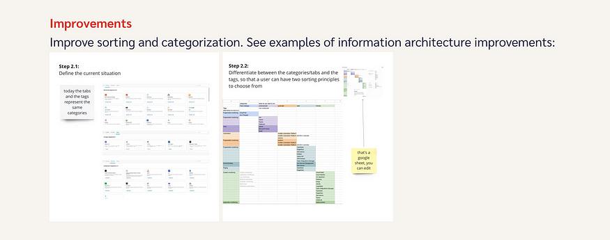
First of all, make sure that images are crisp even on high-resolution screens. But then also think about how the image supports the story you’re telling. If you’re talking about learning how users currently solve a problem, place an image of a user journey map below that paragraph, number the image, refer to it in the paragraph, and add a caption to elaborate on the context (Fig 3).
Well-placed, contextual imagery helps tremendously those who skim your case studies — that’s everyone. Make it easier for them to grasp the interesting details about your work.
Failing to explain how your actions impacted the design process
This is often the consequence of using a cookie-cutter template and is a killer for design managers at relatively design-mature companies. If you go from user interviews to personas, to user journey maps, to sketches, wireframes, and visual designs without explaining how at least one of them impacted your work you failed.
You’re either faking your design process trying to make it fit the illusion of a perfect ideal, or you actually follow this linear process. Either way, this is not what design managers want to see.
“I value people who demonstrate a capacity for learning and quickly delving into new areas.”
— Christopher Azar, Group Design Manager, Digital Video & Audio (Source)
If you conducted user interviews, explain how your learnings informed what you did afterwards. Did they complain about a particular feature in the product so you decided to conduct user testing afterwards? Or maybe that’s why you created a user journey map. How did that map inform the next step? Remember, not all steps are required in a design process. Design is not a linear process, it’s a messy and chaotic one. How you navigate through it and still achieve results is what design managers want to see.
Related read:
90% of designers are unhirable?
Or why your cookie-cutter portfolio doesn’t cut it and how to fix it
It’s not just your portfolio, it’s your attitude too
Designers who have the enthusiasm for the craft of design and love translating that into their portfolios: avoid the mistakes outlined above. You’re on the right track to propelling your career to new heights.
Those of you who are enthusiastic about the craft of design but hate designing your portfolios: embrace it and learn to love it. Fix your attitude towards that and then you’ll be able to invest the effort and the energy required to create a stellar portfolio that will land you a better job and build foundations for an illustrious career.
Whichever group you belong to, you need to realise that a good portfolio can’t be created overnight and just once. You need to learn how to improve it and iterate. After a couple of iterations, you’ll see how poor the first iteration actually was, and you’ll be glad that you pushed through it.
If you need examples of good portfolios, here are two to take inspiration from: Olivia Truong and Daniel Autry.
Conclusion: Embrace the role of your portfolio and invest in it
Designers need to accept and embrace the role of portfolios in design hiring. Some portfolios are poor because the designers behind them are sloppy and don’t have the right attitude towards their craft (so they make mistakes out of ignorance), and others make mistakes despite their right attitude but due to a lack of experience or using poor templates. The current slump in design hiring can’t tell the difference between the two, so they all suffer equally.
Skilled UX designers continue to be in high demand, with many hiring managers struggling to find top candidates (Source).
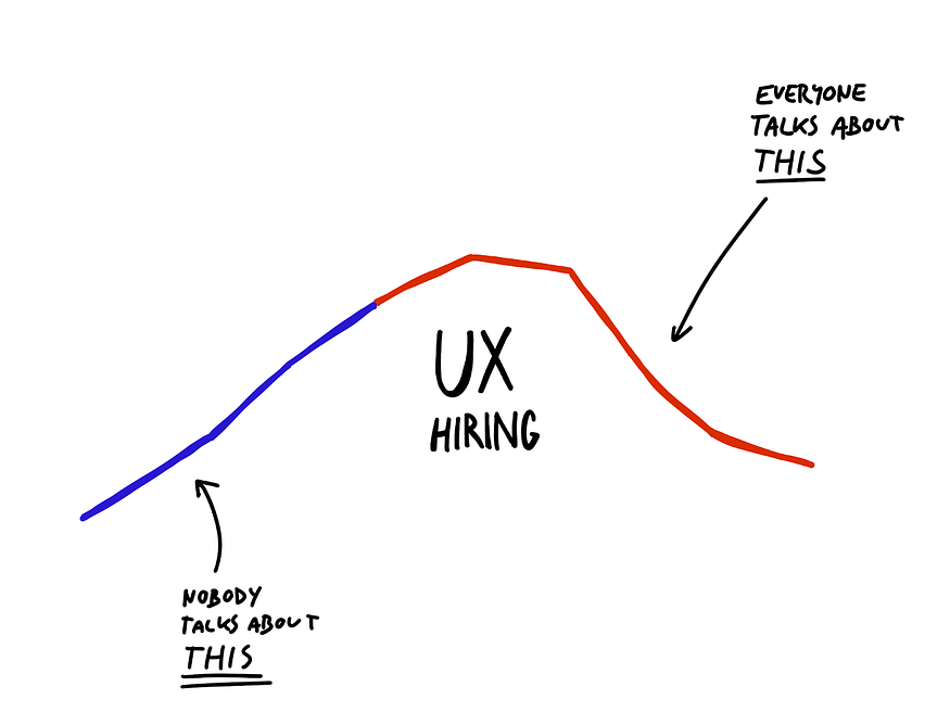
Avoid these common mistakes (or adjust your attitude) and you can vastly improve your chances of getting a new (and better) job. This needed to be said. Will you answer your wake-up call? Will you put extra effort into crafting your portfolio? Let the sloppy, grumpy designers complain about the “terrible” UX job market.
🤫 Psst! My new online course UX Buddy helps designers create their UX portfolio, find, and get an awesome UX design job with a UX/design-mature company. It’s now live and enrolment is open for a couple more days. Check it out!
Source Medium by Matej Latin
