
Yazhan: A Harmony of Heritage and Craft
Client: [Client Name/Brand – if available, otherwise implied]
Design Agency: IYD (It’s Your Designer)
Location: Hosur, Tamil Nadu, India
Project Overview:
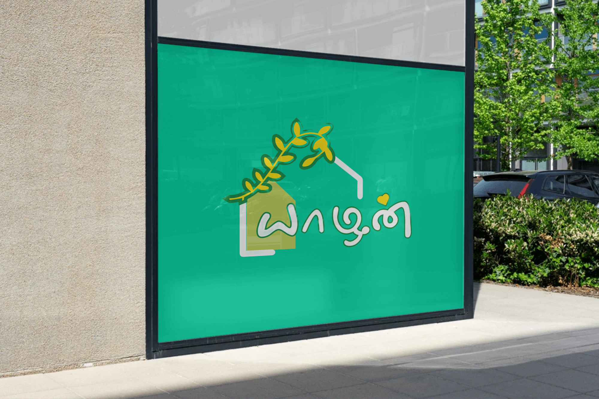
The “Yazhan” logo is a carefully crafted emblem designed to represent a unique brand that blends traditional Tamil heritage with a love for artistry and nature. The concept brief outlined the need to visually communicate a combination of “shop,” “flower,” “Yazh” (Tamil’s oldest musical instrument), and “love” within a single, cohesive design. The design challenge was to create a logo that is not only aesthetically pleasing but also rich in cultural significance and versatile for various applications.
Concept Breakdown & Symbolism:
- Shop (Home/Structure): The foundational element of the logo is a subtle representation of a home or a shop. This signifies a welcoming space, a place of origin, and a hub for transactions or creative endeavors. It anchors the other elements, suggesting a physical location where the brand’s offerings can be found.
- Flower/Leaf (Nature & Growth): A vibrant, organic branch with leaves (or a stylized flower) gracefully emerges from the “shop” structure. This element symbolizes nature, growth, freshness, and beauty. It brings a sense of life and vitality to the logo, hinting at natural products, organic themes, or the flourishing of creativity.
- Yazh (யாழ் – Tamil’s Oldest Musical Instrument): The curves and lines within the overall composition subtly echo the form of the Yazh, an ancient and revered stringed musical instrument of Tamil Nadu. This inclusion pays homage to rich Tamil culture and history, evoking themes of melody, rhythm, artistry, and timeless tradition. It adds a layer of sophistication and cultural depth to the brand’s identity.
- Love (Heart Motif): A small, elegant heart shape is integrated into the Tamil script of “யாதன்” (Yazhan). This universally recognized symbol conveys affection, passion, care, and dedication. It reinforces the emotional connection the brand aims to foster with its customers, suggesting products or services created with love and intended to be cherished.
- The Name “Yazhan” (யாதன்): The name itself is prominently featured, written in elegant Tamil script. “Yazhan” directly references the ancient musical instrument, further cementing the brand’s connection to Tamil heritage and artistic expression.
Color Palette (as per attached logo):
The chosen color palette plays a crucial role in conveying the brand’s essence:
- Teal/Aqua Green (Background): A refreshing and inviting hue, this green evokes feelings of nature, tranquility, growth, and prosperity. It provides a calming yet vibrant base for the logo.
- Lime Green (House/Shop & Leaves): A brighter, more energetic green that complements the teal, symbolizing freshness, new beginnings, and vitality.
- Golden Yellow (Leaves/Flower & Yazh elements): A rich, warm yellow that signifies quality, premium craftsmanship, joy, and cultural richness. It adds a touch of elegance and highlights the artistic elements.
- White (Outlines & Text): Clean and crisp, white provides excellent contrast, enhancing readability and giving the logo a modern, refined edge.
- Red/Pink (Small Heart): A subtle touch of red or pink for the heart, representing love, passion, and warmth, adding an emotional dimension to the overall design.
Design Philosophy & Execution by IYD:
IYD (It’s Your Designer) from Hosur, Tamil Nadu, approached this project with a deep understanding of cultural nuances and modern design principles. The execution focused on:
- Simplicity & Clarity: Ensuring all complex elements are distilled into a clean, recognizable form.
- Cultural Resonance: Authentically incorporating Tamil heritage without being overtly traditional.
- Versatility: Designing a logo that translates effectively across various mediums, from digital platforms to physical merchandise.
- Brand Storytelling: Crafting a visual narrative that instantly communicates the brand’s core values and offerings.
